El Jardín de Fuego
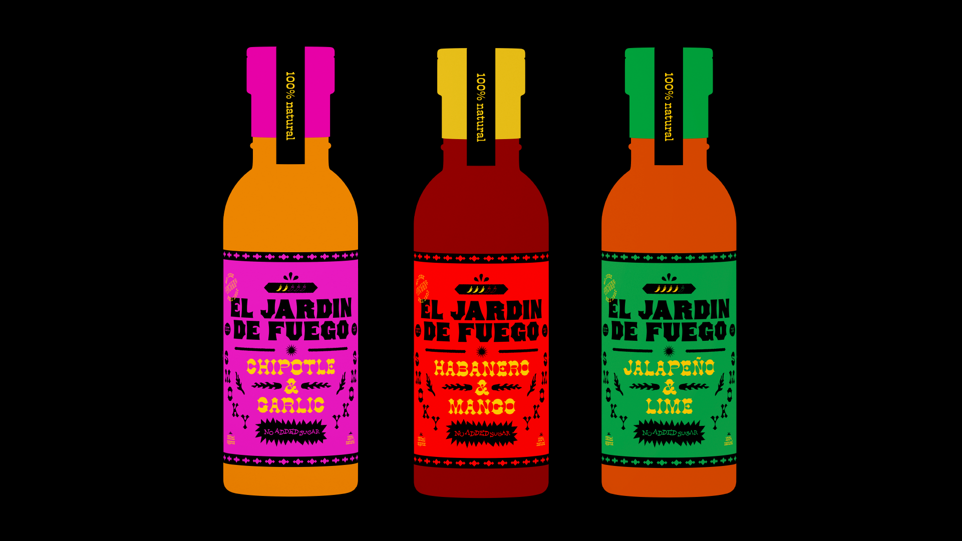
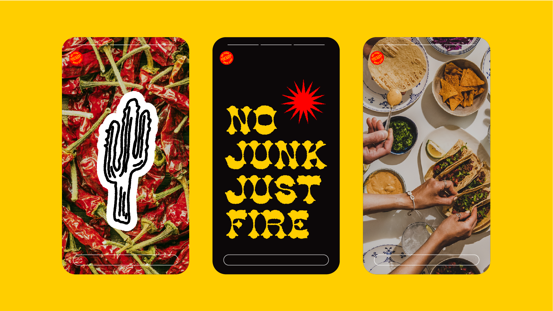
El Jardín de Fuego is a bold, fun hot sauce brand that brings the heat in both flavour and design. I wanted it to feel energetic, exciting, and totally different from the usual rustic-style hot sauce brands. The goal was to create something that jumps off the shelf and makes an instant impression.
I designed a set of custom hand-drawn illustrations to bring personality to the brand. Each one adds to the story with fiery details and playful elements that reflect the intensity of the sauce. The typography is just as expressive, strong, character-filled, and full of attitude. It’s bold, slightly unconventional, and helps reinforce the brand’s punchy, high-energy feel.
Instead of the typical deep reds and browns, I went for a vibrant color palette that stands out. Each flavor has its own unique color combo, making it easy to spot while still feeling part of the same brand family. The result is a hot sauce that not only tastes amazing but looks just as fiery and fun.


